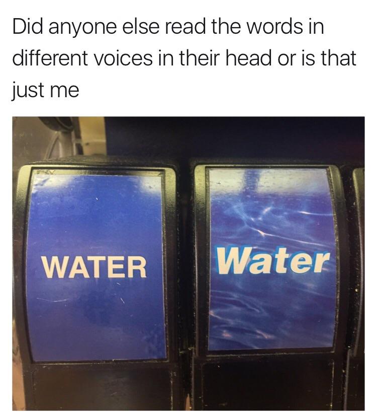
I saw this image go around on social media (sorry, not sure where it started!) and it cracked me up. This is a super quick, humorous example of metacognition and the impact of style on how we understand what we're reading.
If you want to use it with students, you might want to follow it up by pointing out that it's important to look at author's craft/craft and structure on all texts--even if they seem similar (like a textbook in science vs. one in social studies)--because there are things that happen automatically in our brain that help or hinder our understanding. Thankfully, there probably isn't much to understand about water vs water but you could lead into a some discussion questions: Which sign do you think would have mineral water... or sparkling water.. or might be cold or hot? Why? Now look at the headings in your textbook or the article or a website or blog: How might the font choices influence how you read the text in your head or aloud? How does the text and/or it's impact on what you're hearing in your head help or hurt your understanding of the message?
I hope you found this as amusing as I did. Happy summer!
Want to discuss this? Contact us at info@projectcriss.com or tweet your comment to us @ProjectCRISS. We'll add comments here!

